Showing posts with label CreateSpace. Show all posts

Sunday, March 10, 2013

My Computer Decided It Wants to Live! Plus a Publishing Update

      
Final version of the cover for
The Storm-Wing
(Watch for publication soon!)
       Wouldn't you know it?  I call for a computer repairman, he's coming out at 8:30 Monday morning -- and immediately my computer decides to begin behaving like it was brand-new!  I have not had a single hiccup since noon on Friday!  Oh, well, I'll go ahead and get it diagnosed.  I just hope the technician doesn't find any fatal flaw, because I really don't want to get a new computer.
 
       Therefore, my silence over the last two days had nothing to do with computer problems.  I've been completing the formatting of The Storm-Wing (v.2 of The Labors of Ki'shto'ba Huge-Head) and I've uploaded it on CreateSpace.  I had a couple of dinky but pesky problems that took most of yesterday and part of today to solve.  One involved pagination (sigh -- the eternal flaw in Word).  There are quite a few preliminary pages and I wanted them paged a certain way, with small Roman numerals.  And I couldn't get "ii" off a blank page without causing the numbers to disappear from some of the subsequent pages.  Blank pages are not supposed to have numbers on them.  I finally solved the problem -- don't ask me how.
       Then CreateSpace told me my little title page drawing (shown below) didn't have enough DPI.  I was puzzled, because I thought that the t.p. drawings on The Termite Queen were simply copied over from Word and not even put in .jpg format.  It turned out that the problem was the eyes.  I have used a fill containing little dots for the eyes in my cover drawings, but the strange thing with the fill is that it won't change size if you change the size of the drawing.  After a couple of unsuccessful adjustments I just deleted the fill with the dots and made the eyes solid gray.  Then it took the plain drawing without a quibble.
Di'fa'kro'mi the Remembrancer,
narrator of the Labors series
       I'm waiting now for approval to publish.  But I think this time I'm going to order a printed proof copy.  I think that's a good idea, because it was hard to tell in the online mock-up whether the t.p. drawing is going to look right. I'm not in any hurry to publish, anyway, so I don't mind waiting 10 days or so.  In the meantime I can work on the Kindle and Smashwords editions -- I haven't even begun that formatting.  However, it's pretty easy once you've done it a few times.  The only time-consuming aspect is embedding the footnotes in the text.  Then, once all three are available, I'll put up some kind of celebratory special offer!  So stay tuned!

Sunday, August 26, 2012

My Latest Thoughts on Formatting for Self-Publishing

       Before I return to the serious side of life and continue my discussion of the Mythmaker philosophy, I thought I would comment on the system I've worked out for formatting later volumes of "The Labors of Ki'shto'ba Huge-Head."  I don't know whether anybody will find it useful, but people do seem interested in how-to-do-it material.
       In my post on my other blog "
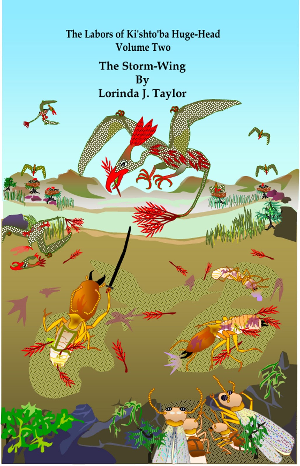
So What's New with v.2 of 'Labors'?" I discussed the new title I've settled on for v.2 ("The Storm-Wing") and mentioned I was in the process of doing some revision on the text.  I'll have to go through this same process with each of the remaining five volumes, so I'm beginning to fall into a routine.
       I set up what I call the "Master Copy."  (I'll remind everybody that I use Word.)  When I divided the original v.2 into two parts, it effectively messed up the formatting.  Word never seems to carry styles over between documents.   I don't know what other people do, but I've always composed using a style called Body Text or Body Text Indent that I've engineered to fit my requirements of paragraph indention, spacing, etc.  This will work OK when you are formatting for print (PDF doesn't seem to care what styles you use), but it won't work for Smashwords (not sure about Kindle).  So the best thing to do is simply Select All and convert the entire document to Normal style right at the beginning.  Basing the whole thing on Normal will work for all formats and it's what Smashwords requires.
      Once you're in Normal, all formatting disappears, even centering, bold type, paragraphing -- everything except the ToC, where the field links to the chapter headings remain (which is nice -- you can still easily navigate the document).  So you have to go through and reformat things like the title page, the chapter headings, the division breaks within chapters (by that I mean, the row of asterisks or whatever you use to break up your chapters).  All that is easily done as you make your final revision and proofing of the text.
       The section breaks also will remain.  Keep those in the Master Copy -- again, for ease of navigation.  Remove any headers or page numbers.  When you do the CreateSpace template, those will have to be inserted in that format; it will be entirely different from what you do in your basic document.
       Base everything you do on the Master Copy.  If, for example, you change some text when you're fitting the document into your CreateSpace template, be sure to make the change in the Master Copy.  That way when you're ready to do Kindle and Smashwords, you'll know you have exactly the same text you used for print.
       Add all the back-of-the-t.p. material to the Master, but don't worry too much about form, since each version will have some differences.  Same with the end matter; write in whatever you want for the print version, and be prepared to adapt it for the e-books.
       Don't mess with the ToC form.  It won't look right in Normal style, but it's still usable; besides,  for the print version it will have to be done over by hand, and it will have to be completely reworked and relinked using bookmarks and hyperlinks for the e-book versions.
      You'll have to reformat all your paragraphing.  I do the chapters one at a time.  I set up the chapter headings, then select the entire chapter text, right-click, click on Paragraph, and then set up the Indents and Spacing the way I want it.  Be sure to remove any paragraph indentions on centered material like chapter headings, title page materials, division breaks, etc., or they'll be off-center.  I use 0.3 indention and single space, and left justification.  There is no point in justifying the Master Document because it doesn't work for e-books; and in the CS template, as I recall, it justifies itself when you copy the text in. 
       I also take Widow and Orphan control off for the entire document.  That way I don't have to remember to remove it when I set up the print template.  That is done in the paragraph formatting box by clicking on the Line and Page Break tab, then unchecking Widow and Orphan Control.
       Do not activate Automatic Hyphenation for the Master Copy.  That's only needed when you put the material into the print template; you don't want it in the e-books because you'll get weird hyphenated words in the middles of lines.  Because line lengths aren't set, there is no way you can divide words at the ends of lines in e-books.
       Use a basic type face like TNR and 12-point type for the Master Copy.  Or you could change it to 11-point if that's what you want for your print copy.  I prefer to use 12-point because that's what I'll want for the e-books.  But be careful when you're doing the print template; if you change the text in the template and copy it over to the Master, you'll get a mix of type sizes; and vice versa -- if you copy a change from the Master into the template, it will remain 12-point.  I had that problem with v.1 of "Labors" and had to check type sizes carefully throughout both documents before I was finished.  I found a way to do that using the Find and Replace feature.  You can search for type-size and simply replace all instances of the wrong size with the right size.
       On the t.p. I type "This is the Master Copy" and highlight it in blue, so I won't get it mixed up with any other draft.  As for the document title, what I do is simply leave it short.  For example, v.2 is titled, "MS - Ki'shto'ba Tales - v.2, Storm-Wing."  When I do the different versions, I add to that basic title terms like:
"Createspace Template"
"CreateSpace Template - PDF"
"Kindle"
"Kindle HTML"
"Smashwords"
as appropriate.  Thus, everything remains grouped together in the Documents List, with the Master Copy title at the top.
       When you're ready to do the Kindle version, make a copy of your Master (don't make changes in the master itself, or you'll lose all your work).  Then replace all the section breaks with page breaks (Kindle wants page breaks between chapters).  When you do the Smashwords, make a copy of your Master and remove all section and page breaks (Smashwords doesn't want any breaks at all except paragraph returns, and not an excessive amount of those). 
       Kindle won't take hanging indention, but it will take a combination of indented lines and unindented lines (block paragraphs) and I believe it will take built-in before-and-after spacing on paragraphs.  However, Smashwords won't; they insist on nothing but centered text and indented paragraphs (no mix of block and indented paragraphs is allowed).  Smashwords also won't take built-in before-and-after spacing on paragraphs -- the meat grinder will kick it back at you if you leave some of that in.  If you stick to only centered material, indented paragraphs, and line spacing using only paragraph returns, you're safe in all e-books.  Be sure to activate the paragraph marks so you can see exactly what you've got, because those rules have to be applied to blank lines as well, and it will also enable you to make sure you've taken out the section breaks.  That's important to remember, especially with Smashwords.
 
       This post is kind of a nit-picky mess, but maybe some of you will find some useful information in it.  I hope so!  Comment with any questions you might have!


Wednesday, July 25, 2012

CreateSpace Mixup Resolved!

       CreateSpace got back to me promptly and told me they would send me a postage-paid label for UPS so I could send back the 28 books.  That works!  Now all I have to do is engineer getting the 50-lb. box over to the UPS store.
       Then they said they would rush me a delivery of my four copies of  "Stolen Mother."  They said I should get it Thursday.  So imagine my surprise when yesterday evening I received a UPS package with the four copies that I had originally ordered!  Oh, great!  Now I have a second order coming that I haven't paid for!  More hassle!  I wrote 'em again.  They said they couldn't cancel an order once it had been printed, but I could call a certain number to see if the second order had been shipped yet.        
       So I did that.  And they told me that I could just keep the second order free since I had been subjected to so much inconvenience!  Problem solved!
       Now I'll have eight copies of the book, plus the one I ordered from Amazon that I didn't need!  Oh, my!  I should have some kind of free give-away for the extra four copies!  But I do hate wrapping and mailing stuff, so I probably won't do that, at least not right away!

       All in all, I can truthfully say, CreateSpace handled all this quite satisfactorily.  I give them 5 stars for that, although only 4 stars overall, since they set the problem in motion in the beginning!  And by the way, the book looks great!  The map is exactly the way I drew it.  The front cover is a little dark -- it's a night scene after all -- but basically I'm happy with the book as an artifact. I hope some of you will want to see it, too.  But just in case you don't, the Kindle version should be appearing within two days.  It will lack the map, and the footnotes will be interspersed within the text.

Tuesday, July 24, 2012

CreateSpace Screws Up Big Time!

       Would you believe I haven't seen a copy of "The War of the Stolen Mother" yet?  It was published on 7/16/12 and I ordered 4 copies from CreateSpace on 7/17.  They are always as slow as molasses shipping the order.  Why this is, I do not know.  Amazon can print and ship books in two days.
       Anyway, yesterday evening I got my order.  I was busy at the time and couldn't rush to answer the door so the UPS man left the box.  And it was a humongous box -- must have weighed 60 lbs!  I thought, Good grief, I only ordered four copies -- they must have sent extra books. I could barely wrestle the box into the house.
       Well, it was worse than I thought.  They sent extra copies all right -- 28 copies of somebody else's novel and none of my books!  Twenty-eight copies!  It had my packing slip, so they just mixed up the orders.  The other person probably has my books.  Imagine her surprise when she got this little light box and opened it to find these big termites staring at her!  I found the author's blog and left a message.  Poor thing -- I'll bet she was planning a book signing!  I hope it's more than a week away or she'll have no books to sign!
       In the meantime, I have to figure out how to return this overweight box to CreateSpace.  I left them a message this morning explaining the situation and I told them I will not pay the postage and how would they propose to reimburse me.? In the meantime, I'm going to find out if UPS will send stuff COD.  Probably not.  Maybe I'll go right now and look in the web and see if I can find out.  Back in a minute ...

       OK, UPS does have a COD system! (See http://www.ups.com/content/us/en/shipping/time/service/value_added/cod.html )  So maybe I can use that.  I'll have to have CreateSpace's permission first, of course. 
       Then there's  the problem of -- how do I get that awful heavy box to the UPS office?  I just checked on that, too, and UPS will pick up packages.  That would be infinitely preferable.  Otherwise, I'll have to empty the box, put the box in my car, then take the books out a few at a time and pack the box in the car, then hope somebody in the UPS office will carry it in for me, because there is no way I can carry that box!
       This is NOT what I want to be doing with my time!  Growl!
       Not only that -- in order to have a copy of my own book, I just ordered one from Amazon.  They cost only $6.08 from CS, but I'm tired of waiting.  So I paid $15.46 and I'll get $3.36 royalty back, so my own book cost me about $12.00.  But at least I'll be able to see the book by Thursday!

Sunday, July 15, 2012

Formatting Illustrations for CreateSpace, and Other Miscellany

       No publication yet!  This morning the virtual proof was ready and so I started glancing through it, and darned if I didn't see a place where I left a word divided at the end of a page.  Oh, well, I thought, one instance of that won't hurt.  But then I started to spot more! -- plus a place where there was a gap of two spaces at the end of a page, and another place where the final page of a chapter started one line down from the top ...  I thought I had caught everything like that!  But obviously I hadn't, so I decided I would have to make corrections and upload another PDF.  That means going through the whole review process again, so we'll see what the new proof looks like tomorrow. 
      
         Sigh.  Back to what I'd intended to write today!  Within two hours of posting yesterday's piece on CreateSpace formatting, I had nine page views of it!  Weird!  I think I should specialize in formatting text!  (By today, I have 13 views.)


       Here's the final map for "The War of the Stolen Mother."  In the book it will be displayed lengthwise, facing the title page.  As you can see, it's black and white, which I figured would print without any hassle.  My little line drawings on the title pages haven't caused the slightest stir, and the line border I put around the facsimile 30th-century title page went through without a bit of a quibble. But apparently the fills that I used for mountains, marsh, and hills (taken from the Patterns in the Fill Effects menu of the drawing tools) required an upgrade to 300 dpi.  Phoo! 
       So I tried grouping everything together and running it through GIMP the same way I do with the cover art.  I flattened it and upgraded the dpi to (I think) 350 (I usually do 325 for the covers).  Then I wasn't sure how to insert it into the CreateSpace template because there is no "Upload" feature (at least, nothing I know about).  Turned out to be easy.  On the Pictures folder, you can just right-click on the picture you want to use and click Copy.  Then you can paste it directly into your template.  Apparently it retains the dpi count.  I also learned how to turn the picture (as I did for the version above).  Just right-click the image shown in the Pictures folder and click on  Rotate Clockwise or Counterclockwise.  (I'll have to remember that feature, because it means I could have drawn this map in a normal position instead of sideways (getting a crick in my neck!)
       Then when I uploaded the text again, I get the message that the illustration is 299 dpi!  ???  Who knows why?  It takes 325 on the covers just fine.  So I went through the whole process again using 400 dpi.  Then it took it.  So my advice is, any illustration you want to use in the text should be made into a .jpg and upgraded to 400 dpi using GIMP or some other image manipulation program.
       The proof came through OK, but it did say there was a problem with a "transparency" and they had flattened it and it might come out looking slightly different.  That's a puzzlement!  I know I flattened the map in GIMP because the text and the lines on the map didn't show up until it was flattened.  Maybe they were referring to the t.p. drawing, which I didn't run through GIMP (I didn't do that on my earlier books, either.)  Anyway, I'm just ignoring that. I don't think there will be a problem.  The virtual proof looks fine.  I still think I'm going to publish without getting a printed proof.  Hope I won't be sorry.


       Here is one other problem I'll just mention today.  I found the following search phrase on my Stats:  "createspace justified text leaves big spaces."  I did address that problem in my first post on formatting.  See the section "Justification and Automatic Hyphenation." I had to do a lot of that with "War of the Stolen Mother" because it's impossible to divide a name like Di'fa'kro'mi.  It's not that there aren't syllables -- it's that dividing a word like this looks stupid:  Di'fa'-
kro'mi. 
       Furthermore, sometimes a word isn't included in Word's automatic division dictionary.  One of these words is "Remembrancer."  I must have manually divided "Remem-brancer" dozens of times.  If a word really is indivisible, all you can do is adjust the line lengths by moving down little words (like "in" or "to") at the ends of lines, or by just plain rewriting the paragraph.  It's amazing what you can achieve by changing "said Di'fa'kro'mi" to "Di'fa'kro'mi said"!


Saturday, July 14, 2012

More on Formatting Books with CreateSpace

       I just finished formatting for print publication "The War of the Stolen Mother," which is the first volume of my series "The Labors of Ki'shto'ba Huge-Head."  I'm waiting for it to be approved.  As with all things, it continues to be a learning experience.  I thought sure that nothing would be wrong with the upload this time!  But no, there were still problems!  So I thought I would discuss the situation a little bit, since my other post, Formatting Print Books with CreateSpace, is my most popular post of all time!  It's had 83 page views, and the one on Preparing a Cover for Your CreateSpace Book has had 43.  I hope my discussions have proved useful!  I know that I myself consult them when I can't remember what I did!
Embedded fonts
       I still got that same message -- "some fonts are not embedded" -- and the display refused to show me where the problem was (I know it's supposed to).   I thought I had everything reduced to Times New Roman, Lucida Bright (which I used on the t.p. and other peripheral material), and Arial (which I used on the map).  So I checked the embedded fonts in the PDF document that I had uploaded, and it did list Garamond (can't seem to get rid of that) and Book Antigua (which I used on "Termite Queen" but didn't use here).  I had had some trouble getting the page numbers changed from TQ's Book Antigua into TNR, and now I've found a new way to check what fonts are in the document.  This is Word 2007 (I think) that I'm talking about.  Open the template document, go to the Find menu, expand to More, then click Format, and Font.  Scroll the list of fonts and find the one you're looking for, e.g. Book Antigua.  Back on the basic Find box, below the Find What bar, it will say: Format: Font: Book Antigua.  Then bring up the drop-down menu Find In, and click in turn on Main Document, Headers & Footers, and Footnotes (as appropriate).  A line will come up telling you how many times that font occurs.  They even include areas that are formatted for that font but have no text (such as a footer but no page number, or a blank header.)
       This process did show me 18 places where Book Antigua still remained.  I think they were page numbers (with numbers, the font very much resembles TNR, so it's really hard to tell the difference by just looking).  And I was able to fix everything at one swoop by using Find and Replace.  I just had it find all instances of Book Antigua and replace it with TNR.  In the same way, I simply replaced any residual Garamond with TNR (even though I'm sure they were all blank lines).
       So that fixed it, right?  No!  On the next upload it points to one place where the font is not embedded!  It was the very first line of the very first page!  That had to be a blank header!  But in the original document, that header was formatted for TNR!  The same thing happened with TQ, v.2 - it told me that half a line of text used a font that was not embedded, but there it was, big as life -- TNR!  I think their system gets a little goofy at times.
       CreateSpace will let you go ahead and approve the upload with some fonts not embedded -- they always say they will embed them for you but it could change the look of the text.  Well, it can't change the look of the text of a line with no text on it!  So I just ignored the problem. 
       But there was another problem, and it involved the map that forms the frontispiece of the book.  I'll talk about that in my next post. 

Thursday, March 15, 2012

Preparing a Cover for Your CreateSpace Book

        Now that the first volume of "The Termite Queen" has finally been published, I mean to get back to a series of more normal blog entries. First, let me say that I added a paragraph to the post on formatting the text for CreateSpace -- just a little hint on how to get page numbers to hold their formatting.
        I'm currently working on the cover art for Volume Two. I had already made a drawing for v. 1 and all I had to do was adjust it to fit the 8.5 x 5.5 book size. Since originally I had not intended to publish in two volumes, I had to start from scratch for v. 2. My best friend, who is an artist, made very sure that I knew I had no talent for figure drawing, but she likes my termites. So I've settled on a view of the Shshi army with the fortress in the background and the Champion Ki'shto'ba and Kwi'ga'ga'tei the Holy Seer in the foreground, shown at the moment they are receiving the Speaking of the Dead. I have to draw the fortress very carefully, one stone at a time. Tedious. Furthermore, I've had a problem about where to put the title. I tried extending it across the panoply of the pair of fortress towers, but that meant lightening the background colors so the text would stand out. Didn't work well. Now I've decided to make one tower complete and show the text against the other, which I am going to leave plain, without stones. I think this will work. After I get to a certain point, I'll post a preliminary draft and ask for opinions.
       The rest of this post will deal with how to prepare your own cover for CreateSpace. (Everything I say here pertains to Word because it's the only program that I know. I realize many people work in other programs, but there must similarities that would make what I have to say useful.)
       It would work the same whether you draw your own illustration or make something out of photos or out of other people's illustrations. The best way is to use CreateSpace's CoverCreator feature. When you pick a size for your book, that will be the size for your cover. You can also use one of their ready-made, generic covers. That's what I did for the print version of "Monster Is in the Eye of the Beholder" because the cover has to be at least 300 dots-per-inch and a normal computer drawing will have only some 90. At that time I had no way of converting my drawing to 300. Now I have GIMP and it works great to scale a drawing to a denser dpi. I won't go into how to use it. If anybody needs help doing that, I could tell them what I do, but that's the only thing I understand about GIMP. It's too complicated to learn when I'm so familiar with the Word drawing tools. I scale the drawing to 325 dpi because when I did it to exactly 300, CoverCreator rejected it, saying it was only 299.
       If you're not using a generic cover, page through the sample covers until you come to -- and I think this is right -- the one called "Palm." This one allows you to upload a front cover and a back cover of your own, after which it provides a spine in the appropiate thickness for your book. Obviously, you must have uploaded your text before you can do the spine, but you can enter the front and back cover before you upload the text. You pick a color for the spine that works with your covers You also pick the color for the text on the spine, and there is some choice of font.
       A different form will allow you to upload the back cover, spine, and front cover in one piece. I didn't use this because I really don't know how to draw it to a proper scale so that it would work. This would be good to use if you wanted your drawing to wrap around the spine, but I can't tell you how to do it.
       The "Palm" template tells you the exact dimensions for your cover drawing, allowing for what is called "bleed." The color must extend past the exact size of the cover, because the book will be trimmed and you don't want to risk getting a white stripe along the edge. You also don't want anything important too close to the edge, because it might get trimmed off. For a book that is 8.5" by 5.5", "Palm" will tell you to make the cover 9" x 5.75". Now obviously, that means you will be leaving a quarter inch at the top and bottom (9 minus 8.5 leaves half an inch to be divided between the top and the bottom). Anything in that area is likely to be trimmed off.
       But I was puzzled -- should I place the edge of the cover against the spine and leave the full quarter-inch of extra width on the outer edge, or should I divide the quarter-inch into 1/8" on each side? I sent CreateSpace a question and they had no idea what I was talking about and they got off on a totally different subject, and I never learned a thing about it!
       But I did learn from trial and error. I fixed the cover with the entire quarter inch at the outer edge and uploaded and that worked well. Even so, you shouldn't put anything important too close to the spine edge, because there will be a crease that forms there as the cover is opened. The template prints a line where the three outer edges will be trimmed. The best thing is to leave a slight (at least 1/4") margin inside this and also along the spine.
       I learned the most by uploading the cover and looking to see how things fit. You can always go back and make some improving adjustments and try it again. For example, I decided my title was too close to the top to look right, so I moved it down a little. I also moved some of the stars and the antennae of the Highest Mother slightly inward.
       The cover has to be a JPEG. You can use Word's built-in Paint program to turn a computer drawing into a JPEG, but the dpi won't be 300+. So copy your drawing into GIMP (or whatever program you use that lets you scale the dpi). Scale the drawing to the appropriate size and dpi and save it as a JPEG. Then you're ready to upload the image in the Cover Creator and see it it looks the way you want.
       Once I got all the tools in place, making a workable cover was actually the simplest part of the preparation process in publishing a POD on CreateSpace.

So now ... back to drawing those cotton-pickin' stones!


Monday, March 5, 2012

Formatting Print Books with CreateSpace

       Having formatted two books on CreateSpace hardly makes me an expert, but I thought other beginners in the POD game might benefit from a  review of what I've learned and of the problems I've encountered.
       I had almost no problems with "Monster Is in the Eye of the Beholder."  There are a few minor flaws in the book, but they were my fault.  But "TQ" is much longer and more complex and it's got those danged Wingdings.  Strangely enough, however, they didn't prove to be a problem at all.

       Formatted template:  CS will give you a formatted template in the size you select ("Termite Queen" is 5.5 by 8.5), and that helps a whole lot because it defines the areas of the page where you can put text.  You have to stay within certain margins or your text will get trimmed off in the binding process.

       Fonts: The template gives you pages marked "Your title here" and Copyright, Acknowlegements, Dedication, Chapter 1, Chapter 2, etc., but you can change, eliminate, and add pages however you want.  The template also uses certain fonts -- strangely, it used Garamond and Myriad Pro.  Does anybody use those fonts?  You will avoid problems later if you simply "Select All" and reformat the entire template in Times New Roman or whatever font you want for your base text.  Don't forget to do the same with the headers and footers -- even on blank pages!  Then as you feed the text in, you can make font changes as desired.  I did my base text in TNR and all my peripheral matter -- preliminaries, end matter, headers, footers, chapter headings, and epigraphs -- in Book Antigua.
      
       Book design:  You want to make your book look as much like a professionally designed book as possible.  The best way to ensure that is to study the professionally designed books that you own.  For example, a book should not open directly on the title page and CS doesn't provide fly leaves, so I added a half-title -- a page before the title page that has nothing on it but an abbreviated form of the title.  Also, unless you own your own imprint (I wish I did, but I really don't know how to get one), the t.p. is going to look very bald.  So I made a little black-and-white line drawing of Ki'shto'ba and put it at the bottom of the t.p. (kind of like a logo) and lo and behold!  CS didn't object.
      
       Leaves vs. pages, and margins:  Then you have the problem of remembering that you're working with leaves, not the one-sided pages of manuscripts.  In a book a leaf has two pages -- two sides -- what book-people call "recto" and "verso."  CS doesn't even seem to know these terms -- they call them odd and even pages, which works fine, actually.  "Recto," meaning "right," is the right-hand page when you open a book, and "verso" (think "reverse") is the back of the recto.  Books always start on a recto, hence it becomes p.1 (an odd-numbered page).  The verso will always be even-numbered.  The verso will be on the left and the recto on the right as you open a book.
       This makes a difference because in order to bind a book correctly, the "gutter" (the inner margins where the leaves come together) has to be wider than the outer margins.  This is all set up for you in the template -- odd-numbered pages, such as the t.p., must always have a wider left margin and a narrow right margin, while the even-numbered pages will be the reverse.  Examine any book and this will become clear.
       But it's easy to lose track until you get comfortable with the system.  I must have gone through my books a couple of dozen times  in order to be sure everything was positioned the way I wanted it.  You have to think, OK, do I want this recto to have a blank verso?  The t.p. will have the copyright information on the verso.  In "TQ", I put all those permissions acknowledgments on the facing (recto) page, with a blank verso.  Then came the Dedication, recto with a blank verso.  Then the Contents, recto again with blank verso.  Finally the epigraph for the entire book, followed by the half-title for the first section.  Each of those is a recto with a blank verso.  That brings you to the first chapter, which must begin on a recto (odd numbered page). 

       Chapters:  What about chapters -- should they always begin on a recto?  I checked some books and some did that, but most just began the chapter on the next page, be it verso or recto.  So that's what I did, because "TQ" is long enough as it is.
      
       Managing headers and footers: You achieve all that by tinkering with the section and page breaks.  Sigh.  One of my least favorite things to do in Word.  It will help to clarify things if you activate the formatting symbols (the Paragraph sign on the toolbar).  The template gives you small Roman numeral page numbers for the preliminary matter, but I decided on no page numbering until I started the text.  Please don't ask me for advice on how to do page numbers and headers.  It has to do with the linking of sections, and while I always manage to get it done, I can never remember afterward how I worked it out.  Stuff always keeps popping back into existence or disappearing when you don't want it to!  It is just the most complicated and inexplicable thing I ever tried to do.  And I've been using Word since 2000!
       One useful thing about the template is the fact that it's set up with different odd and even pages.  That means that adding Headers becomes easier.  Most books have a different header on the verso and the recto.  In my case, I use "The Termite Queen" on the verso (left-hand page) and the Part designation on the recto.  I have two parts in the book, so midway through I had to change the Header on the right-hand page.  This also is accomplished by breaking the links on the sections.  I have a separate section for each chapter.
       I put the page numbers at the bottom of the pages.  That's the way the template is set up, and while I didn't have much of a problem changing them to the upper left and right corners of the pages on "Monster," I couldn't get rid of them in "TQ"!  They kept resurrecting themselves!  So infuriating!  So I decided it didn't look so bad to have them at the bottom and I left them there.
       [Addendum (3/12/12):  Here's another hint on getting your page numbers to toe the line.  (I'm speaking of Word here.) I would format my page numbers in the font and type size I wanted and then the next page would revert to the default for the template.  Then I discovered that if you highlight the number that is correct and right-click it, you get a menu that has the term "Update Field." If you click on that, then your page numbers won't revert to the default.  This doesn't seem to work for headers.  Apparently page numbers are a field, but headers are not.]

       Spacing and Indentation: A chapter should start a third or close to a half down the page.  I used 11-point type on both books, but on "Monster" (a short novella) I used that "Multiple" line spacing designation on the Paragraph formatting box.  That spaces the lines at 1.15 and makes it easier to read.  "TQ" is very long, so I used single spacing. 
       Be careful about paragraph indentation!  When I got the first proof, I kept thinking, the title and the table of contents, etc., don't look centered -- what's the problem?  And then it occurred to me to check the paragraph indention and darned if it wasn't on!  That threw off the centering by 5 spaces.  So that's something to watch for.

       Widow-and-orphan control:  I always use that on my manuscripts so that I won't have pages ending with single lines, or even single words hanging over on the next page.  I did that on "Monster" and didn't notice anything weird because, while the book has no chapters, it does have a number of odd breaks (it's written in the form of the report of a government committee).  The problem with w&o control is that it leaves blank gaps at the ends of some pages.  So I examined a bunch of my own professionally produced books, and not a single one of them used w&o!  Every book I looked at had single lines ending and beginning pages, and every page ended at exactly the same spot! 
       So I removed w&o control for the entire text.  I would recommend doing that
      
       Justification and automatic hyphenation:  The text must be justified.  That means that some lines will have big spaces in them --  distracting and unprofessional-looking.  So I activated automatic hyphenating at the ends of lines.  Works great -- except that the computer's feeble little brain often misdivides the syllables!  Therefore, I ended up examining every division to be sure it was correct.  Some are obviously right, but I made a lot of use of Dictionary.com!  If you don't have the patience to do this, you can get by, but you have to reconcile yourself to the division of "piqued" as "pi-qued" at the end of a line!  Personally, I can't stand that kind of ignorant sloppiness!
       Automatic hyphenation also produces the problem of dividing words at the ends of pages, which I was always taught is a no-no.  I checked every page for this problem and then either did some manual word division, manual line breaks, or a minor rewrite to get rid of the problem. 
       I won't discuss any problems with formatting the epigraphs, since their use is rare.  I also have some poetry in the text, which created some problems, but that's so specialized I won't discuss it here either.
      
       The final upload:  Now the problems with the upload.  CS recommends turning the doc into a PDF, but it will also take doc., docx. and something else that I don't remember.  For "Monster" I used a PDF -- no problem.  It printed it exactly as it appeared in Adobe Reader.  But I had a complication with the paging in "TQ."  I wanted to start the first chapter as p.3 because I wanted the half-title for the first part to be p.1.  This necessitated 2 pages without page numbers, and I did that with section breaks, but the PDF kept putting in two extra blank pages.  I could not get those to go away!  So I elected to upload my docx. version directly.
       And that's when CS wiped out my hard-won, carefully edited hyphenation!  That caused big holes in the text in places.  I couldn't have that.  So I created my own PDF and uploaded that.  Then the hyphenation came out fine -- but they bellowed at me that there were three blank pages in a row in the text and that was a no-no!  So then I gave up and changed my paging so the first chapter begins at p.1.  That got rid of the two extra pages. 
       I would recommend never uploading anything but a PDF, and don't tinker any more than you have to with the pagination.

       Embedded Fonts: That wasn't the only problem, though.  It kept telling me that the PDF had fonts that weren't embedded.  I didn't even know what that meant.  I've learned a little more now.  After you put a doc in Adobe Reader, open the tab File at the top of the page, then Properties, then Fonts.  That will tell you what is embedded.  I was sure the problem was my Wingdings, but darned if it didn't say Wingdings 3 was embedded!  Then I thought, it says Garamond is embedded -- I didn't use any Garamond (remember when I said the template was originally in Garamond?)  So that's when I discovered that a lot of the blank lines were still in Garamond! 
       Then I uploaded again -- and the same thing:  a font not embedded!  What the heck?!!  This time I was able to identify the location of the problem.  It was on a blank page -- one little blank footer that remained in Myriad Pro, which was not embedded in my PDF document!  CreateSpace said they would embed the font and in that case I couldn't see doing it over just for that, so I approved it!  And it went through! 
       And that's why I said that the first thing you should do is change the entire template to your base font before you start -- including every header and every footer!  You may save yourself some problems in the end!

       Cover:  I haven't addressed the cover problem.  Maybe I'll do a different post on that topic.